

If your website still looks like it did in 2022, your customers have noticed. Web design trends move fast, and what felt fresh two years ago now reads as dated the moment a visitor lands on your homepage.
For Calgary businesses, this matters more than most owners realize. A slow, cluttered, or outdated site doesn’t just look bad. It costs you leads. And in a market where local competitors are investing in professional web design services in Calgary, falling behind on design isn’t really an option anymore.
This guide walks through the web design trends actually shaping 2026, why they matter for a local business (not just design agencies chasing awards), and how to figure out which ones are worth your budget.
Why web design trends actually matter for your business
Trends can feel like fluff. Something design blogs write about to fill content calendars.
But here’s the thing: most of these trends exist because they solve a real problem. Faster load times. Better mobile navigation. Clearer visual hierarchy. Google’s algorithm rewards sites that do these things well, and so do your customers.
A Calgary plumbing company and a Calgary law firm don’t need identical websites. But both need a site that loads fast, works on a phone, and doesn’t confuse visitors within the first 5 seconds. That’s where trends and fundamentals overlap, and it’s also where local SEO and web design start working together instead of competing for budget.
AI-driven design is changing how sites get built
AI tools are now baked into how a lot of websites get designed and built. Layout suggestions, content generation, even real-time personalization based on visitor behavior.
For small businesses, this shows up in a few practical ways:
- Chat-based navigation that helps visitors find services faster
- AI-assisted layout tools that speed up design timelines (and lower costs)
- Smarter image and content recommendations during the build process
We’re not talking about robots designing your site from scratch. It’s more like AI handling the repetitive parts so designers can focus on the parts that actually need a human eye, like brand voice and customer experience.
If you’re weighing a full website redesign this year, ask your web team how they’re using AI tools. It usually means faster turnaround without sacrificing quality.
Bold typography is doing more of the talking
Big, expressive headlines aren’t new, but 2026 pushes this further. Type isn’t just decoration anymore. On a lot of modern sites, it’s the main visual element carrying the message.
You’ll see this in a few forms:
- Large-scale headlines that dominate the hero section
- Kinetic typography, where text moves or reacts as you scroll
- Pairing a bold serif headline with a clean monospace font for details like dates or buttons
One caution here. Kinetic typography looks great as a single moment, usually in your hero section. Overuse it across every page and it starts feeling gimmicky instead of premium. One strong animated headline beats five mediocre ones.
3D and spatial elements are creeping into flat screens
Apple Vision Pro and Meta Quest pushed designers to think in three dimensions, and that thinking is bleeding back into regular websites now, even ones nobody’s viewing through a headset.
You’ll notice it in small ways:
- Cards with layered shadows that make them look like they’re floating above the page
- Hover effects that tilt or lift an element slightly, giving it a sense of depth
- Parallax scrolling, where background and foreground move at different speeds
None of this requires a huge budget. A well-placed shadow and a subtle hover animation can make a page feel more polished without touching your core layout. It’s one of those small details that visitors notice without being able to say exactly why the site feels “nicer” than a competitor’s.
Performance is a design decision now, not just a technical one
Here’s something a lot of business owners miss. A beautiful website that takes 8 seconds to load isn’t a good website. Google agrees, and so do your visitors, most of whom leave within 3 seconds if nothing appears on screen.
In 2026, designers are treating speed as part of the design brief itself, not something fixed after the fact. That means:
- Lighter animations that don’t tank load times
- Compressed, properly sized images instead of massive uncompressed files
- Simpler code that does more with less, sometimes called “machine experience” design
A fast, slightly simpler site will almost always outperform a slow, flashy one, both in rankings and in actual sales. Worth remembering next time a design idea sounds impressive but heavy.
Bento grid layouts are still everywhere (and still working)
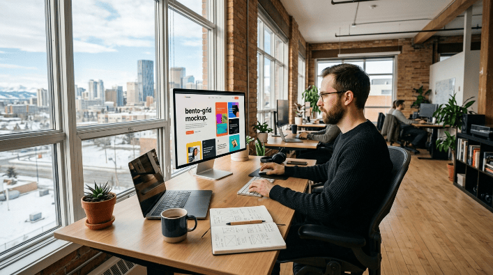
Named after the Japanese lunchbox, bento grids arrange content into modular, asymmetric blocks of varying sizes. You’ve probably seen this on Apple’s product pages or dozens of SaaS landing pages by now.
The reason it works: it lets you visually prioritize content. A bigger block for your main offer, smaller ones for supporting details. Readers scan it naturally.
The mistake most businesses make is treating every block the same size. When nothing stands out, the layout stops doing any real work. If you’re exploring this for your own site, our team can walk you through what genuinely good website design in Calgary looks like when a bento layout is done right.
Motion and scroll-based storytelling
Scrollytelling used to live in magazine-style editorial pieces. Now it’s showing up on product pages, service pages, and even local business sites.
Instead of a static page, content reveals itself as you scroll. A section fades in. An image shifts position. A number counts up. Done well, it makes a site feel alive without slowing it down.
The key word there is “without slowing it down.” A lot of businesses add heavy animation and forget it needs to load fast on mobile too. That balance matters more than the animation itself.
Mobile-first isn’t a trend anymore, it’s the baseline
This one deserves its own section because it’s still one of the most common mistakes we see on Calgary business websites: designing for desktop first, then squeezing it onto mobile as an afterthought.
More than half of local searches happen on a phone. If your menu is hard to tap, your text is too small, or your images take 6 seconds to load, visitors leave before they even see what you offer. This is exactly why responsive web design Calgary businesses invest in has become the standard, not the exception.
We’ve written before about why Calgary businesses need a mobile-first website, and honestly, it’s only gotten more urgent since then. Google also uses mobile performance as a ranking factor, so this affects your SEO whether you like it or not.

Dark mode and high-contrast palettes
Dark mode moved from a nice-to-have setting into an actual design choice businesses make intentionally. It’s easier on the eyes, feels modern, and often makes product photography or bold colors pop more than a plain white background.
That said, dark mode isn’t right for every industry. A dental clinic or a family-run bakery probably doesn’t need it. A tech company, a creative agency, or a premium service brand might. It comes down to what fits your brand, not just what’s trending.
Accessibility is finally getting the attention it deserves
For years, accessibility got treated as an afterthought. That’s shifting, and it should have shifted a long time ago. Among the UI/UX trends worth watching in 2026, this one has the most real-world impact on actual users, not just aesthetics.
Designing for accessibility means:
- Text that resizes properly without breaking layout
- Enough color contrast for readers with low vision
- Animations that respect “reduced motion” settings
- Navigation that works with a keyboard, not just a mouse
Beyond being the right thing to do, accessible sites also tend to rank better and convert better. Google’s crawlers benefit from the same clean structure that helps a screen reader user navigate your site.
Brutalism is pushing back against the polished look
Here’s a trend that surprises a lot of business owners. After years of clean, minimalist, everything-rounded-corners design, brutalism is having a moment. Raw layouts. Bold color contrast. Unpolished typography that looks almost intentionally rough.
It’s a reaction to how uniform a lot of AI-generated templates have started to look. Brands use brutalism to signal “a real person made this,” not a template.
This isn’t the right fit for every business (a law firm probably shouldn’t go full brutalist), but for creative agencies, fashion brands, or anyone wanting to stand out from a sea of similar-looking competitor sites, it’s worth considering.
Custom design over templates
Templates got a business online fast for years. But as more businesses use the same handful of website builders, a lot of sites started looking identical.
Custom design solves that problem. It costs more upfront, sure. But it also means your site actually looks like your brand instead of a stock layout with your logo swapped in. If you’re weighing template versus custom for an upcoming project, our page on custom website design breaks down when each option makes sense.
A quick look at how this plays out in real projects
Trends are one thing on paper. Seeing them applied to an actual business is where it clicks.
Take City Wide Courier, a Calgary-based delivery company we redesigned recently. The old site was slow, cluttered, and nearly impossible to navigate on a phone. The rebuild focused on exactly what this article covers: mobile-first layout, fast load times, and a clean visual hierarchy that gets visitors to a quote form in seconds instead of minutes.
That’s really the point of following these trends. Not chasing what looks cool on a design blog, but applying the parts that actually move the needle for a real business with real customers.

What this means for your budget
Not every trend needs a full rebuild. Some, like adjusting typography or adding subtle scroll animations, can be layered into an existing site. Others, like moving to a bento grid or going custom instead of template-based, usually call for a full redesign.
|
Trend |
Typical investment level |
Best for |
|
Typography updates |
Low |
Any business wanting a quick refresh |
|
Mobile-first redesign |
Medium to high |
Businesses seeing high mobile bounce rates |
|
Custom bento grid layout |
Medium to high |
Service businesses with multiple offerings |
|
Full custom design |
High |
Brands ready to stand out from competitors |
|
Accessibility improvements |
Low to medium |
Every business, honestly |
If you’re not sure where your project lands on that scale, our breakdown of website costs in Calgary for 2026 gives a clearer picture before you start budgeting.
How to choose which trends are worth it
Not every trend belongs on your site. Here’s a simple way to filter them:
- Does it improve how fast visitors find what they need?
- Does it work just as well on mobile as desktop?
- Does it match your brand, or does it just look trendy?
- Will it still feel current in 2 years, or is it a fad?
If a trend fails more than one of those questions, skip it. Chasing every trend at once usually produces a busy, confusing site instead of a modern one.
For small businesses specifically, we put together practical guidance on small business website design that covers this exact filtering process in more detail.
Common mistakes businesses make when chasing trends
We see the same handful of mistakes over and over when a business tries to modernize its site without a clear plan.
Adding animation everywhere. One or two moments of motion feel premium. Ten of them feel exhausting, and they usually slow the page down too.
Copying a competitor’s layout exactly. A trend that works for a design agency’s portfolio site might not work for a plumbing company. Context matters more than the trend itself.
Ignoring load time in favor of visuals. A gorgeous hero image means nothing if it takes 6 seconds to appear. Compress it, or use a lighter alternative.
Skipping mobile testing. A site that looks great on a 27-inch monitor can fall apart on a phone. Always test on the smallest screen first, not last.
Forgetting the call to action. Trendy design sometimes buries the actual button or form that turns a visitor into a lead. No matter how modern the layout, the path to contacting you needs to stay obvious.
Avoiding these five mistakes matters more than following any single trend on this list.
Working with a local agency versus a freelancer or DIY builder
A lot of Calgary business owners try DIY builders first, and that’s fine for testing an idea. But once you’re relying on your website for actual leads, the gaps show up fast: generic templates, slow support, no real SEO strategy behind the design choices.
If you’re at the point of hiring help, our guide on choosing the best web design company walks through what to actually ask before signing a contract.
Final thoughts
Web design trends aren’t just about looking current. The ones worth adopting almost always tie back to something practical: faster load times, better mobile experience, clearer navigation, or a site that actually represents your brand instead of a generic template.
Calgary businesses that get this right in 2026 aren’t necessarily the ones chasing every new trend. They’re the ones picking the trends that solve real problems for their customers.
If you’re not sure where your current site stands, or you want a second opinion before committing to a redesign, our team at Clear Solutions IT can walk you through what actually makes sense for your business and your budget.