
Most Calgary businesses today have websites that are technically “mobile-friendly,” but very few actually follow a true mobile-first approach. Calgary Business Needs a Mobile-First Website Guide for Calgary Businesses is not just a concept; it reflects a real shift in how customers discover local services. The difference may sound small, but it isn’t. A mobile-first website directly impacts how customers find you, how Google ranks your business, and how effectively visitors convert into calls, bookings, or sales.
The 2026 Mobile Traffic Reality
Mobile traffic isn’t a “growing trend” anymore. It’s the default.
Across most local business categories, somewhere between 65 and 80 percent of website visits now come from a phone. For service businesses like plumbers, dentists, restaurants, and auto shops, that number often runs closer to 85 percent.
This shift isn’t just about volume, though. It’s about behavior, too.
Mobile visitors make faster decisions. They scan instead of reading line by line. They expect a phone number or a booking button within a second or two of landing on a page. A site built for desktop and then shrunk down for mobile just doesn’t match how this traffic actually behaves.
There’s also a patience gap, and it’s gotten wider over the past few years. Mobile users abandon slow pages faster than desktop users do. A delay that felt fine in 2020 can feel broken or untrustworthy today.
For a Calgary business competing against other listings on Google Maps, those extra few seconds of load time often decide who gets the call.
Desktop hasn’t disappeared. It still matters for bigger decisions, like comparing service packages or reading longer reviews. But for that first moment of contact, mobile is where the decision usually happens now.
What Most Mobile-First Guides Get Right?
A lot of the general advice about mobile-first design is genuinely accurate. It’s worth covering quickly, since these are the fundamentals.
Mobile-First Indexing
Google evaluates the mobile version of your website to decide search rankings. This happens even for searches done on a desktop. It’s been the standard for years, and it isn’t optional.
If your mobile site is missing content that exists on your desktop version, Google may not count that content at all.
This catches more businesses off guard than you’d think. A common pattern: a business updates the desktop site with a detailed services section, but the mobile version runs on a separate template and never gets the same update.
Google sees the thinner mobile version as the real site. Rankings drop, even though the desktop page looks complete. Checking that both versions actually match is a quick audit most businesses have never run.
Core Web Vitals and Speed
Page speed and responsiveness are measured mainly on mobile performance. Google tracks how fast your content loads, how quickly the page responds to taps, and whether elements shift around while loading.
Sites that fail these checks tend to rank lower and convert worse, no matter how good the design looks.
Responsive Design Is the Baseline, Not the Finish Line
Most guides correctly point out that responsive design isn’t the same as mobile-first design. Responsive design adjusts to screen size. Mobile-first design is built around mobile constraints from the start.
A responsive site can still carry old desktop habits, like oversized images or long forms, that simply resize without actually improving on a small screen.
Touch-Friendly Navigation and Thumb Zones
This one shows up everywhere, for good reason. Most one-handed phone use happens in the lower half of the screen.
Sites that place buttons within easy thumb reach tend to convert better than sites that stick to a desktop-style top menu.
What Most Mobile-First Guides Leave Out
This is where a lot of generic advice runs out of road, especially for a local Calgary business. These are the parts that actually move results, but rarely get covered in detail.
Local Search Behavior Is Different From General Mobile Behavior
Most mobile-first content treats “mobile users” as one big group. Local searchers don’t really fit that mold.
Someone searching “emergency plumber Calgary” is usually mid-crisis, not casually browsing. Someone searching “best brunch Kensington” is deciding in the next few minutes, often while already out. These searches need a phone number or directions button visible right away, not buried under a hero banner.
This is also where a lot of modern-looking sites still underperform. A beautifully animated homepage with a rotating image gallery might look great, but it can fail the one job a local searcher actually needs done fast: confirming you do what they need, you’re nearby, and you’re reachable right now.
Local intent rewards directness more than polish.
The Google Business Profile Connection
A mobile-first website doesn’t work in isolation from your Google Business Profile. A lot of mobile visitors check your profile first, the reviews, hours, and photos, before clicking through to confirm a detail.
If the mobile site loads slowly or doesn’t quickly confirm what they just saw, that visit usually ends in a bounce.
Most generic mobile-first guides don’t connect these two pieces at all. But local SEO and mobile site quality reinforce each other directly.
Calgary’s Seasonal Search Spikes

Generic advice doesn’t account for local seasonal patterns. Calgary sees sudden spikes in mobile search activity tied to weather and events.
Think “tow truck near me” during a cold snap. Or “patio open” on the first warm weekend. Or food and event searches are spiking hard during Stampede week.
A mobile-first site that loads slowly during one of these spikes loses business in a way that doesn’t show up clearly in slower monthly traffic reports.
Accessibility Compliance Specific to Canada
A lot of mobile-first content mentions accessibility law briefly, but Canadian businesses work under their own framework. The Accessible Canada Act and provincial requirements increasingly affect digital services, not just physical locations.
This usually doesn’t get framed as urgent in general guides. But it’s a real and growing area of legal exposure, and one that overlaps heavily with good mobile design anyway: contrast, font sizing, accessible form labels, and clear navigation.
Industry-Specific Mobile Needs
Most guides treat “mobile-first” as one universal checklist. It isn’t. Priorities shift depending on the type of business.
Why This Gap Matters
None of this means the general advice is wrong. It’s just incomplete.
A Calgary roofing company following a checklist built for a national e-commerce brand might end up with a fast, well-structured site that still underperforms. The technical fundamentals matter everywhere. But the priorities on top of those fundamentals need to match the actual customer and the moment they’re searching in.
Mobile-First Priorities by Industry
|
Industry |
Top Mobile Priority |
Common Mistake |
|
Restaurants and cafes |
Visible hours, menu, and a one-tap call or reservation button |
Large image carousels that slow load time and bury the menu |
|
Trades and home services |
Click-to-call button above the fold, service area clarity |
Long contact forms instead of a direct call option |
|
Healthcare and clinics |
Fast booking flow, clear service list |
Desktop-style intake forms not optimized for mobile typing |
|
Retail and e-commerce |
Fast checkout, mobile wallet support |
Multi-step checkout requiring excessive typing |
|
Professional services (legal, accounting) |
Clear credibility signals, simple contact path |
Dense paragraphs of text not formatted for scanning |
This is one of the bigger gaps in generic mobile-first advice. A checklist built for an e-commerce store doesn’t map cleanly onto a dental clinic or a roofing company.
Take restaurants as an example. The mobile priority isn’t a beautiful photo gallery. It’s answering three questions fast: are you open right now, what’s on the menu, and can I book without calling.
A site that leads with a full-screen image slider pushes the useful information further down the page, right when the visitor has the least patience for scrolling.
Trades and home services face almost the opposite problem. These customers often aren’t browsing; they’re calling. A mobile site for a plumber or electrician succeeds mainly by making the phone number impossible to miss.
A contact form with eight fields, asking for details that could just be discussed on the phone, works against the goal here.
Healthcare and clinic sites carry a different weight too. The visitor is often dealing with discomfort or urgency. Clear service descriptions and a fast booking flow matter more than design flourishes.
Core Web Vitals, the Numbers That Actually Get Measured
|
Metric |
What It Measures |
Good Mobile Target |
|
Largest Contentful Paint (LCP) |
Speed of main content loading |
Under 2.5 seconds |
|
Interaction to Next Paint (INP) |
Responsiveness to taps and clicks |
Under 200 milliseconds |
|
Cumulative Layout Shift (CLS) |
Visual stability while loading |
Under 0.1 |
|
Mobile page weight |
Total size of images, scripts, assets |
Under 2 MB |
|
Time to Interactive |
When the page becomes fully usable |
Under 3.5 seconds |
Google’s free PageSpeed Insights tool checks all of these in under a minute. In our experience auditing local Calgary sites, the most common failure points are LCP and page weight. Almost always, the cause is unoptimized images or too many third-party scripts.
Old Approach vs. Modern Standard
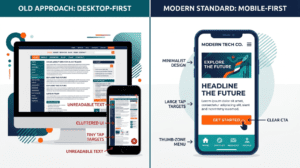
|
Element |
Old Approach (Desktop First) |
Modern Standard (Mobile First) |
|
Design starting point |
Desktop layout, then shrink down |
Smallest screen first, scale up |
|
Navigation |
Top menu bar |
Bottom bar or thumb-reachable menu |
|
Forms |
Long, multi-field |
Short, essential fields only |
|
Speed target |
Under 5 seconds acceptable |
Under 2.5 seconds expected |
|
Typography |
12 to 14px text |
16 to 18px minimum |
|
Primary action |
Buried in content |
Visible without scrolling |
AI Search and the Next Shift in Mobile Optimization
Search itself is changing shape. A growing share of queries now get answered through AI-generated summaries right inside the search results, sometimes called generative engine optimization.
These systems tend to favor sources that are fast, well-structured, and easy to parse. That overlaps heavily with mobile-first fundamentals already covered above.
A slow site, or one with unclear structure, is at a disadvantage in both traditional mobile search and this newer AI-driven layer. This isn’t a separate strategy from mobile-first design. It’s just another reason the fundamentals matter.
For a local business, this shows up practically. Clear, direct answers near the top of a page tend to get pulled into AI summaries more reliably than information scattered across vague paragraphs.
Structuring content this way doesn’t require rewriting everything. Often, it just means moving the most useful information higher up the page.
Site Speed Factors:
Most mobile-first content stops at “compress your images.” A few other factors matter just as much for a Calgary business.
- Network variability. A site tested only on fast office Wi-Fi can feel completely different on patchy LTE coverage downtown.
- Hosting quality. A cheap, shared hosting plan that’s fine for low traffic can become a real bottleneck once a business runs ads or gets featured somewhere.
- Third-party script bloat. Chat widgets, tracking pixels, and marketing tags add up fast. Most business owners have no idea how many are running on their site at once.
Image format matters more than people realize, too. Modern formats like WebP cut file size significantly compared to older JPEG or PNG files, without losing visible quality.
A lot of older websites still serve the heavier formats by default, simply because nobody’s gone back to update them. The same issue applies to custom fonts that load slowly and delay text from appearing on screen.
What Mobile UX Actually Looks Like in Practice
A genuine mobile-first layout makes specific, visible changes compared to a shrunk-down desktop site:
- Sticky call-to-action buttons that stay visible while scrolling
- Contact forms reduced to name, phone, and a short message field
- Click-to-call phone numbers, not just displayed text
- Larger tap targets sized for fingers, not mouse cursors
- Vertical-first image cropping instead of wide desktop banners
Accessibility, Beyond the Legal Minimum
Accessible design isn’t just a compliance checkbox. Good contrast, readable font sizes, properly labeled forms, and large tap targets improve the experience for everyone, not just users relying on assistive technology.
Most of these fixes overlap directly with strong mobile UX and solid SEO. That makes accessibility one of the easiest wins to bundle into a broader search engine optimization Calgary pass.
There’s a practical reason to take this seriously, too, beyond legal exposure. Visitors with low vision, visitors with motor impairments, or even someone trying to read a screen in bright sunlight, all benefit from the same fixes.
None of this requires a full redesign. A lot of it comes down to font size adjustments, basic contrast checks, and form fields with visible, properly attached labels.
A Practical Mobile-First Checklist
|
Task |
Done? |
|
Test the homepage on an actual phone, not a resized browser window |
☐ |
|
Confirm phone number and address are visible without scrolling |
☐ |
|
Check Core Web Vitals scores using PageSpeed Insights |
☐ |
|
Compress and properly size all images |
☐ |
|
Shrink contact forms to essential fields only |
☐ |
|
Add a sticky call-to-action button |
☐ |
|
Confirm forms trigger the correct mobile keyboards |
☐ |
|
Review checkout flow on mobile, if applicable |
☐ |
|
Test the site on a throttled or slower connection |
☐ |
|
Confirm color contrast and font sizing meet accessibility standards |
☐ |
Common Mistakes That Quietly Hurt Conversions
- Designing desktop first, then shrinking down. This almost always produces a weaker mobile experience than building mobile first from the start.
- Unoptimized images. A single uncompressed photo can add real seconds to load time.
- Long contact forms. Every extra field reduces mobile completion rates noticeably.
- Non-clickable phone numbers. A missed tap-to-call is a missed easy conversion.
- No ongoing maintenance. Mobile performance fades over time as plugins update and scripts pile up. A regular website maintenance check catches this before it shows up as lost leads.
If several of these issues are stacking up at once, it’s usually a sign to look at the website as part of a broader website design and digital marketing strategy, rather than fixing one piece at a time.
Measuring Whether the Changes Are Actually Working
Most mobile-first guides stop at the checklist. They rarely explain how to confirm that any of it actually helped.
A few numbers worth tracking after making changes:
- Mobile bounce rate, available in most analytics platforms, should trend down as load time and usability improve.
- Mobile conversion rate, calls, form submissions, and bookings are the number that actually matters financially.
- Discovery search clicks from the Google Business Profile dashboard show whether new customers are finding the business through search.
- Core Web Vitals scores in Google Search Console should improve within a few weeks of fixing image sizes or hosting issues.
These numbers move slowly. A single good or bad week doesn’t mean much. Look at trends over six to eight weeks instead of reacting to daily changes.
What a Mobile-First Redesign Actually Involves
A redesign usually starts with an audit. Where is the current site losing mobile visitors, and why?
From there, it moves into content prioritization. What genuinely needs to be visible first, versus what’s there out of habit? Wireframing starts at the smallest screen size and scales up, not the other way around.
Technical choices matter just as much as the visual design. Image formats, hosting, and script load all factor into the final result.
It’s worth being realistic about the timeline, too. Targeted fixes, like image compression or a sticky call button, can often be done in days. A full mobile-first redesign is usually measured in weeks, especially for a site with several service pages or a booking system.
Rushing a full redesign tends to produce the same shrink-it-down problem all over again, just with a newer-looking template wrapped around the same issues.
Where Calgary Business Needs a Mobile-First Website Guide for Calgary Business
None of this requires rebuilding every website from scratch. Sometimes it’s targeted fixes. Sometimes it’s a full redesign.
What matters is treating mobile as the primary experience, not an afterthought. For most Calgary businesses, mobile is already where most of the traffic, and most of the lost opportunity, actually lives. This guide explains what most mobile-first resources miss, especially for local Calgary businesses in 2026. We’ve seen these same patterns across multiple industries, including mobile performance work done for Arbutus Hardwood. If you improve only one thing on your website this year, this is likely the one with the highest return.
Test your own site on your own phone today. Properly, not just a glance. See how many items on the checklist above you’re actually missing.